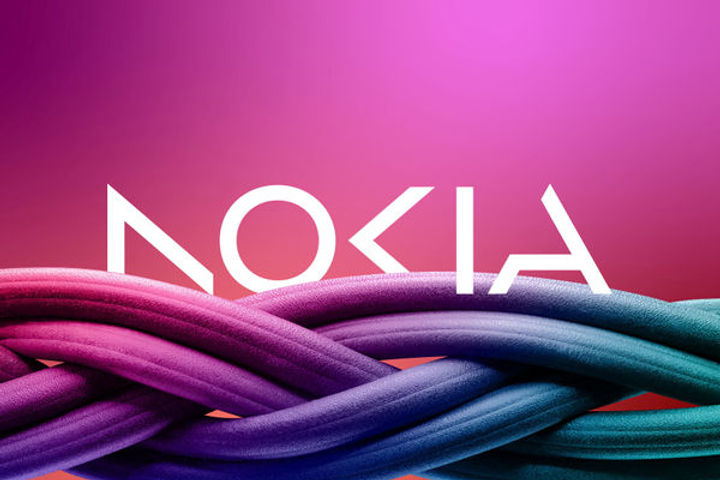
Nokia changes iconic logo to signal strategy shift
Shortpedia
Content Team
Image Credit: reuters
Nokia redesigned its logo on Sunday, to change its brand identity for the first time in 60 years, including a new logo, as part of its push for aggressive growth in the telecom equipment industry. The new logo comprises five different shapes forming the word NOKIA. The iconic blue color of the old logo has been dropped for a range of colours depending on the use.


